

A good photo gallery in WordPress should look great on every screen, load fast, and take minutes to build. Sadly, many site owners get only one of those three.
In this guide, you will build a responsive photo gallery step by step, right inside the WordPress block editor. You will not need any code. By the end, your gallery will adapt to desktop, tablet, and mobile, open photos in a clean lightbox, and load quickly even with lots of images.
We will use the free ShapedGallery block from ShapedPlugin. However, the tips on layouts, alt text, and mobile settings will help you no matter which tool you use.
Before You Start: What You Need
You only need three things to follow along:
Prepare Your Photos First
A few minutes of prep makes a big difference later. First, give your files clear names, such as red-rose-bouquet.jpg instead of IMG_4821.jpg. Next, shrink very large camera files before you upload them, because visitors do not need a 6,000-pixel image to view a gallery. Finally, jot down a short description for each photo. You will use it as alt text in Step 3.
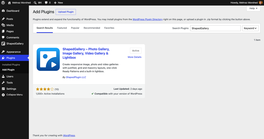
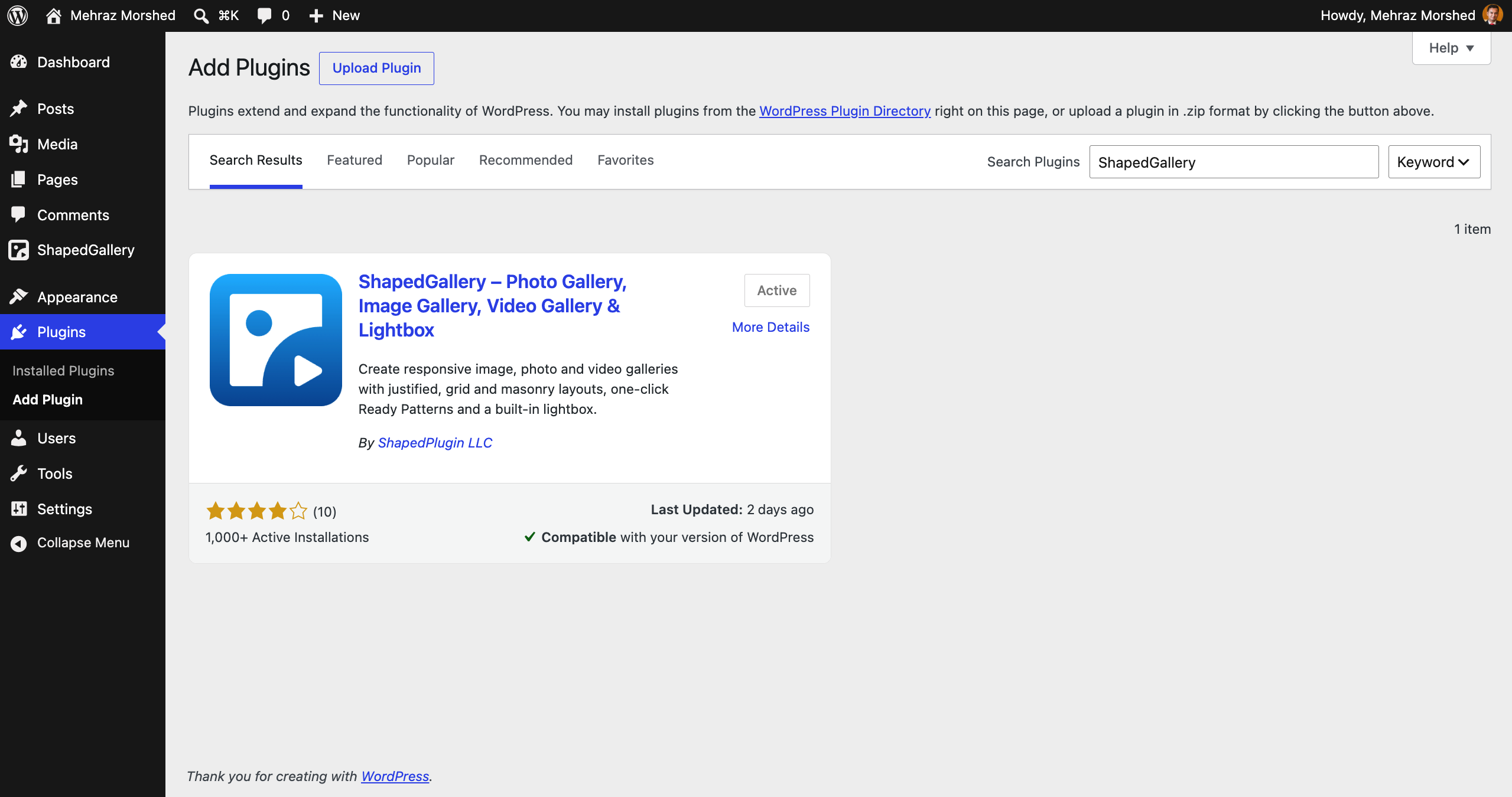
Install ShapedGallery
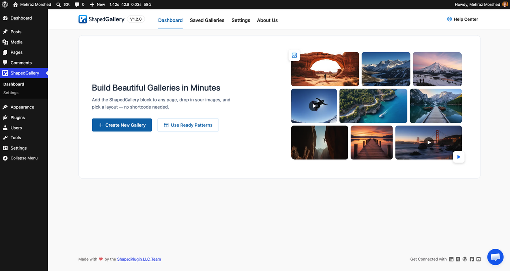
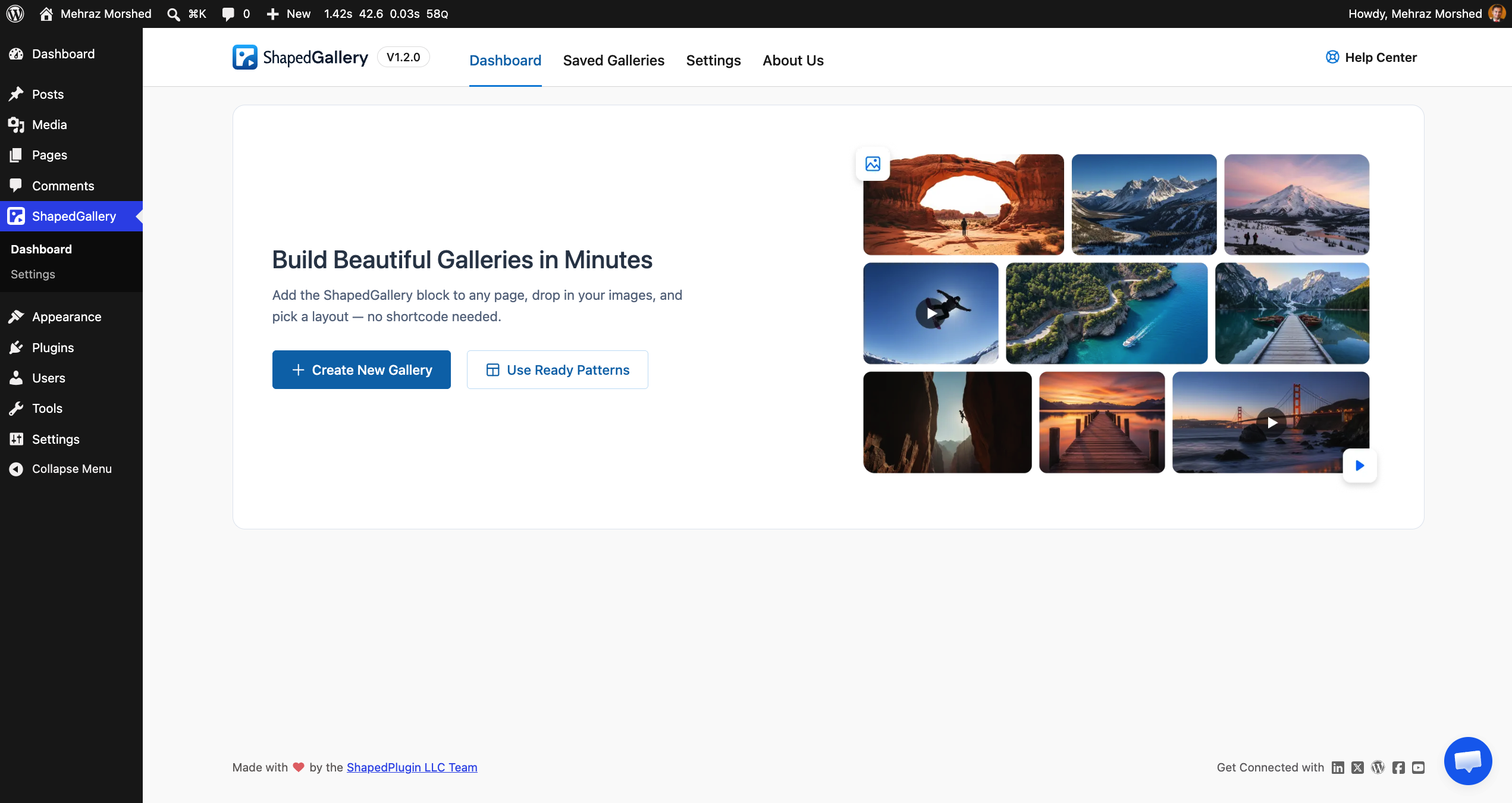
After activation, you will see a new ShapedGallery menu in your dashboard. You do not need to configure anything there yet. Everything in this guide happens inside the block editor.
Step 1: Add the ShapedGallery Block
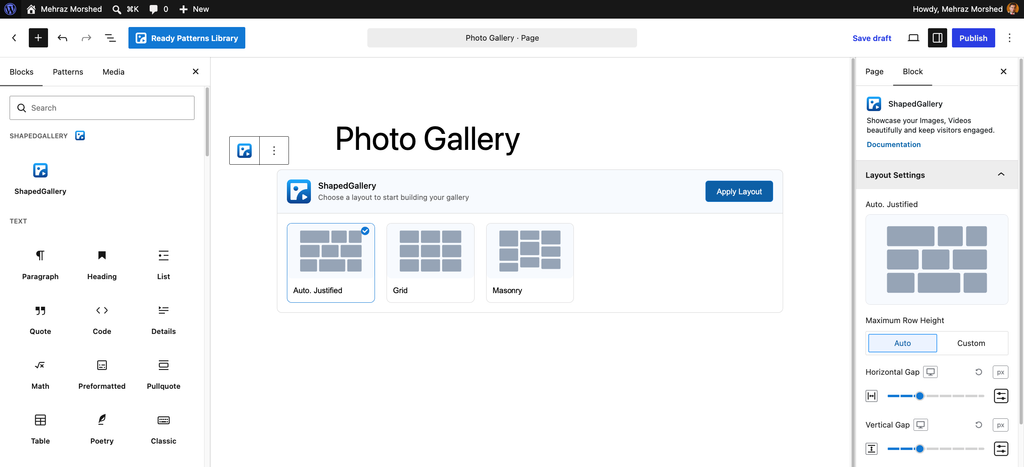
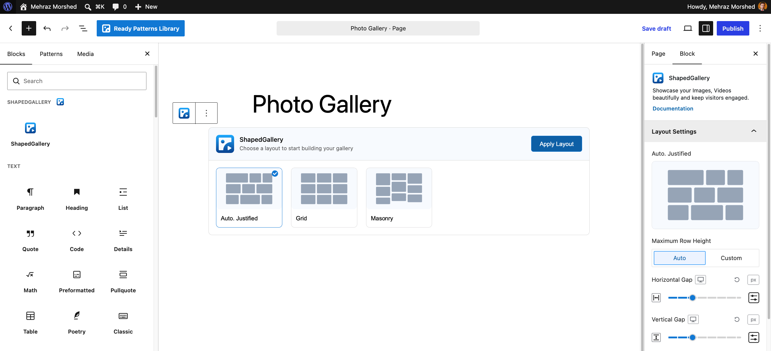
Open the page or post where you want the gallery. Then click the + button to open the block inserter and type ShapedGallery. You can also type “gallery,” “masonry,” or “justified,” and the block will still show up.
Click the block to add it. Right away, ShapedGallery shows you a layout picker instead of an empty box.
Prefer a ready-made design? Click the Ready Patterns Library button in the editor’s top toolbar instead. Pick a pattern you like, click Insert, and then swap in your own photos. It is the fastest way to get a polished look.
Step 2: Choose a Layout That Fits Your Photos
The layout picker asks you to choose a layout to start building your gallery. You will see three options:
|
Layout |
How it looks |
Best for |
|
Auto. Justified |
Rows of equal height; every photo keeps its original shape |
Photographers, travel shots, and mixed portrait and landscape photos |
|
Grid |
Equal square tiles in neat columns; photos get cropped to fit |
Products, team photos, and shots with the same shape |
|
Masonry |
Pinterest-style columns with different heights |
Mood boards, interiors, food, and lifestyle photos |
Select the layout you want and click Apply Layout. Don’t worry about choosing wrong. You can switch layouts later with the Change Layout button in the block toolbar, and your photos stay in place.
Step 3: Add Your Photos and Alt Text
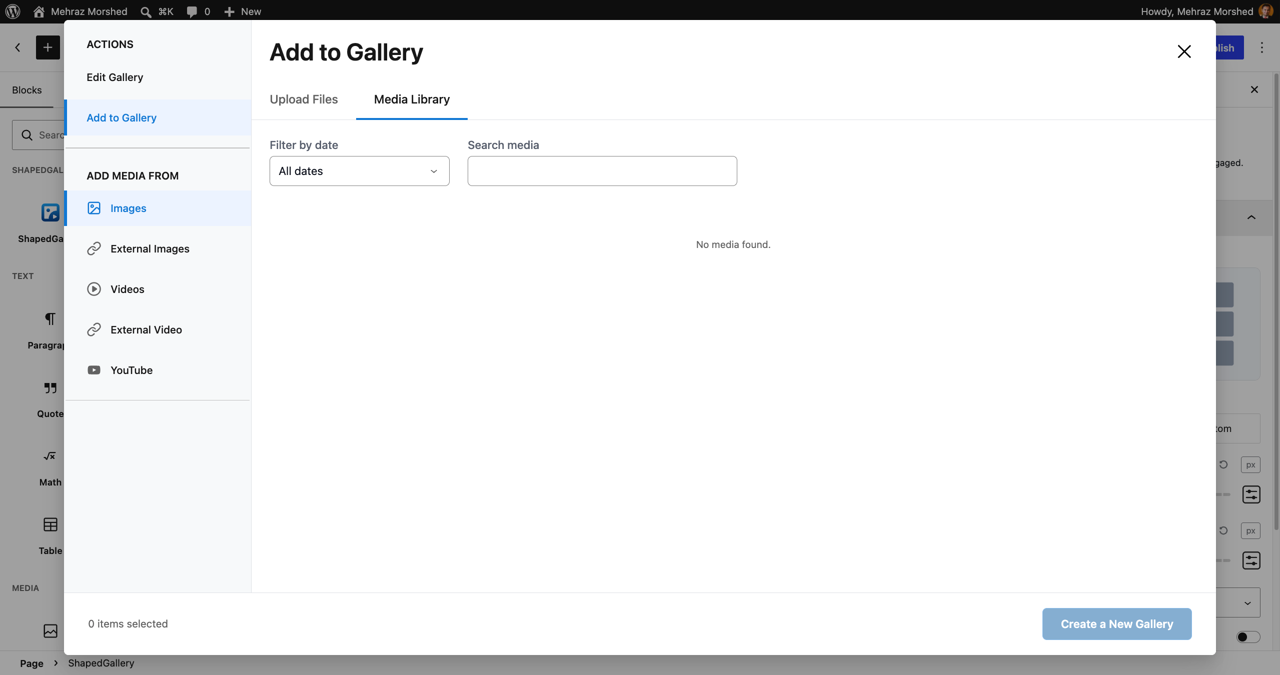
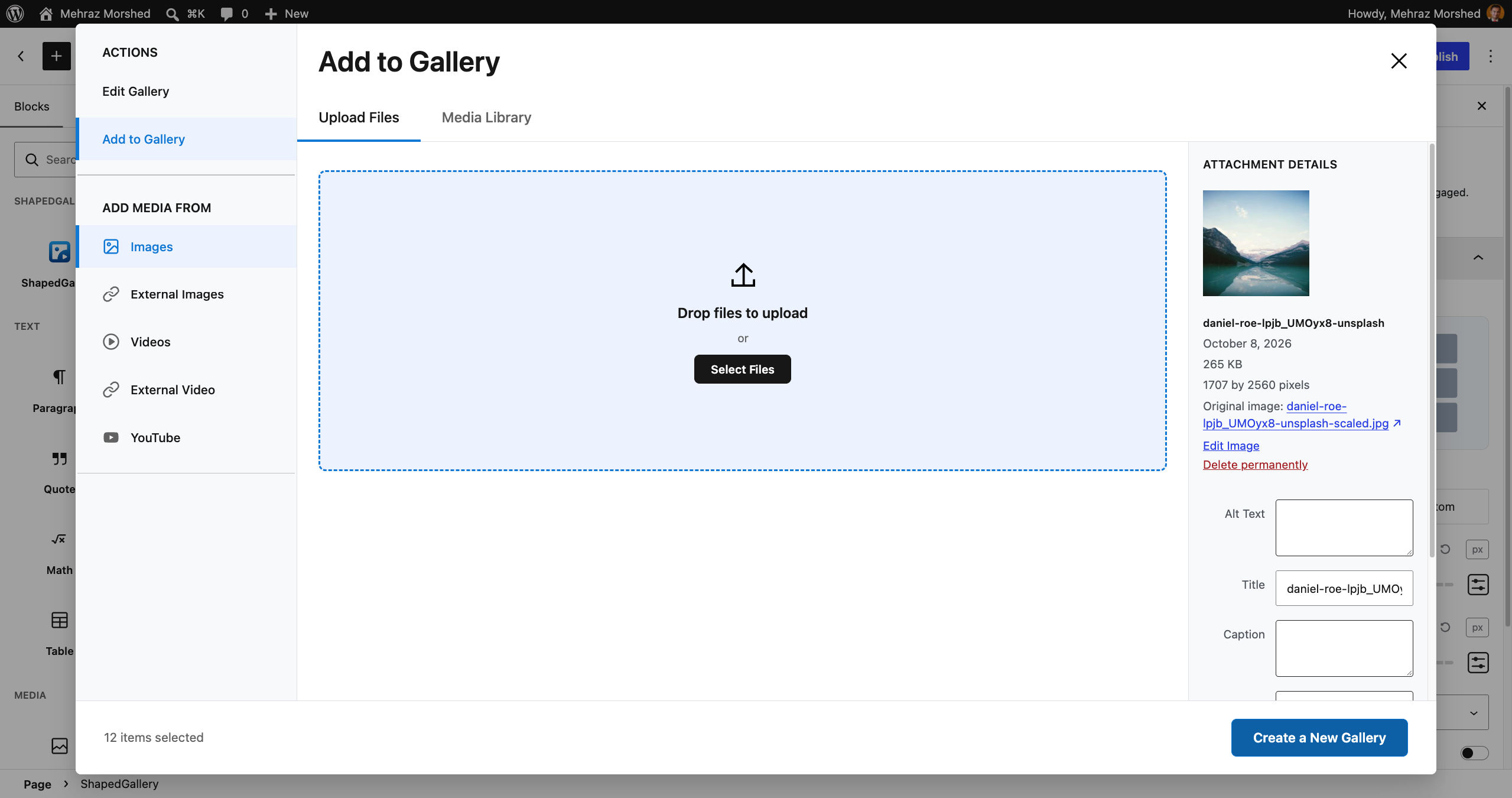
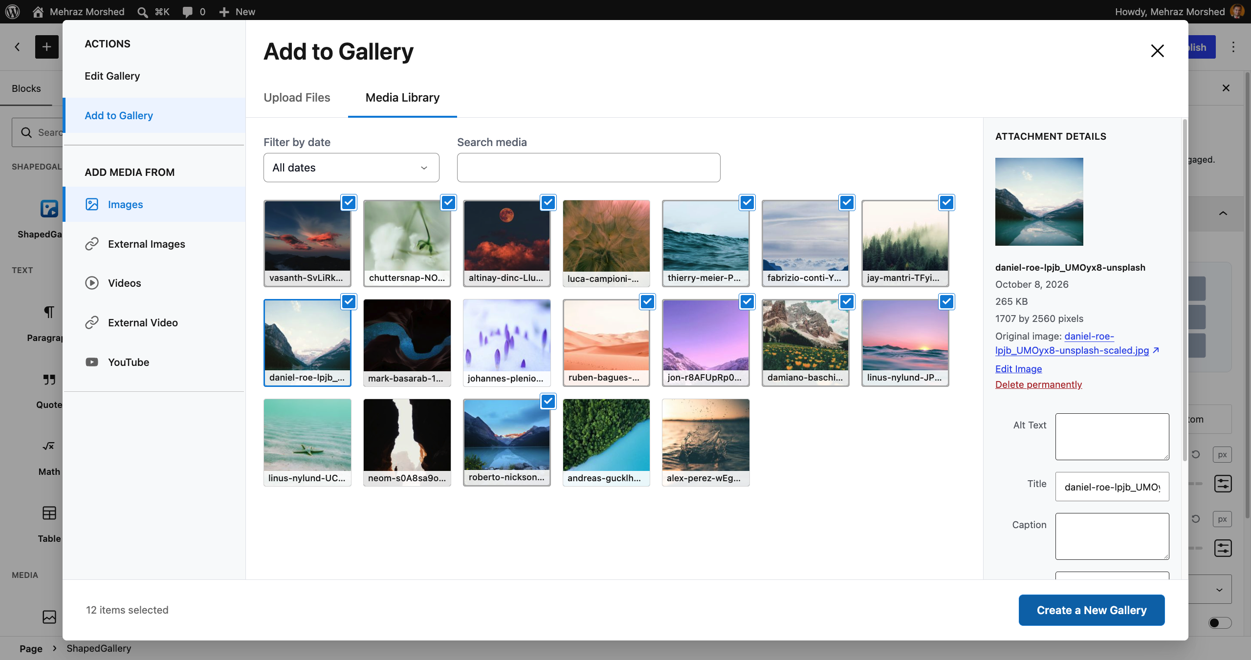
As soon as you apply a layout, the media window opens. On the left, under Add media from, keep Images selected.
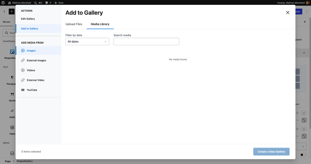
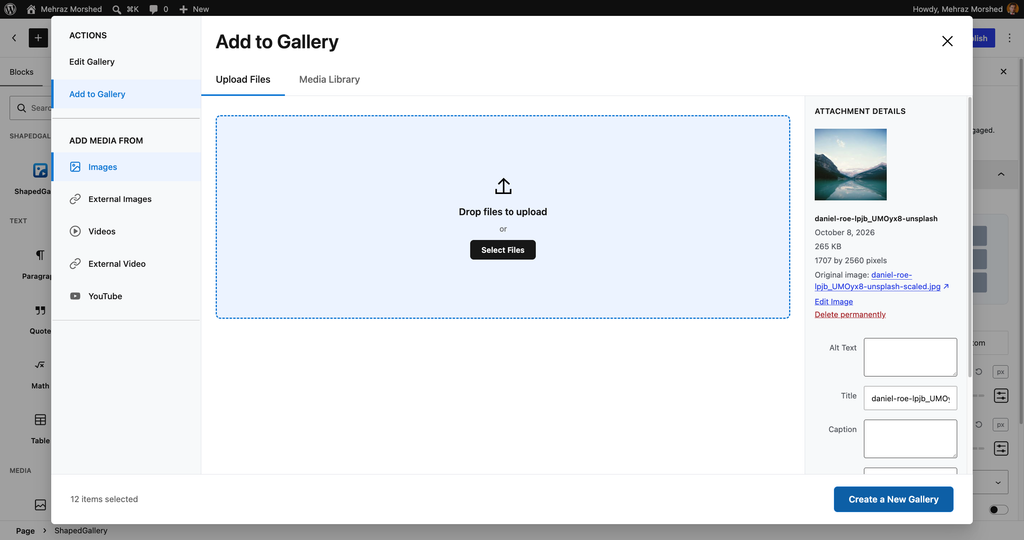
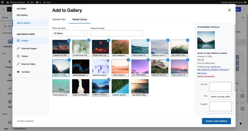
Now you have two choices:
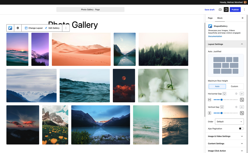
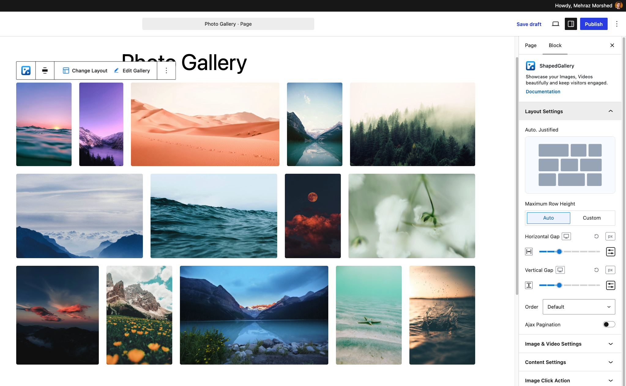
Select all the photos you want, then click Create a New Gallery. Your gallery appears in the editor right away, styled with the layout you chose.
Add Alt Text While You Are Here
Alt text describes a photo for people who use screen readers. It also helps search engines understand your images. Yet the WebAIM Million 2026 report found missing alt text on 53.1% of the top one million home pages, so many sites skip this step. Don’t let yours be one of them.
To add it, click Edit Gallery in the block toolbar and then click a photo. In the Attachment Details panel, fill in the Alt Text field. Keep it short and specific, for example, “Pink peony and white rose bouquet in a glass vase.”
The same panel also lets you edit the Title, Caption, and Description. Fill these in if you plan to show text under your photos in Step 5.
Put Your Photos in the Right Order
Inside Edit Gallery, drag and drop photos to reorder them. Place your strongest photo first, because it sets the first impression. If you want to flip the whole order, use Reverse Order. When you finish, click Update Gallery.
Step 4: Make the Gallery Responsive on Every Device
Click your gallery, then open the block settings sidebar on the right. The Layout Settings panel sits at the top.
Most layout options here are responsive. In other words, you can set a different value for desktop, tablet, and mobile using the device switcher next to each control.
For Grid and Masonry layouts, set the Columns for each device. A good starting point looks like this:
|
Device |
Columns |
Why |
|
Desktop |
4 |
Plenty of space for a full, rich view |
|
Tablet |
3 |
Photos stay large enough to enjoy |
|
Mobile |
2 |
Each photo stays clear on a small screen |
For the Auto. Justified layout, you work with row height instead of columns. Leave Maximum Row Height on Auto, or switch it to Custom and set your own Row Height (px).
Next, adjust the Horizontal Gap and Vertical Gap. Both start at 15px. Smaller gaps feel modern and tight, while larger gaps give each photo more breathing room. On mobile, a slightly smaller gap often looks better.
Handy tip: Want a lighter gallery on phones? Open Advanced Settings and turn on Hide on Mobile Portrait or Hide on Mobile Landscape. Then add a second, shorter gallery and hide that one on desktop. The editor shows a small “Hidden on” note, so you always know which gallery shows where.
Step 5: Style Your Photos and Captions
Now make the gallery match your brand. Open Image & Video Settings first.
After that, open Content Settings if you want text with your photos.
Finally, fine-tune the typography, colors, and spacing until the text feels right.
Step 6: Choose What Happens When Someone Clicks a Photo
Open the Image Click Action panel. Under Click Action Type, you can pick one of three options:
What Visitors Get With the Lightbox
The ShapedGallery lightbox works well on every device. On phones, visitors swipe between photos and pinch to zoom. On desktop, they zoom up to 4x with a double-click or the mouse wheel. Keyboard users can browse with the arrow keys and close the view with Escape.
You can adjust two lightbox options for your whole site under ShapedGallery → Settings → Modules: Close When Click Outside and Item Counter. The counter shows visitors where they are, such as “3 / 24.”
Step 7: Keep Large Galleries Fast With Load More
Twenty photos load quickly. Two hundred photos are a different story, especially on a phone with a weak signal. Luckily, you do not have to choose between a big gallery and a fast page.
In Layout Settings, turn on Ajax Pagination. A new Ajax Pagination panel then appears with these options:
ShapedGallery also handles several speed tasks for you in the background. It lazy loads images as visitors scroll, and it loads its files only on pages that actually show a gallery. For even more control, visit ShapedGallery → Settings → Advanced Controls. There you can manage Retina Images, gallery caching, and browser caching.
Bonus idea: In Layout Settings, set Order to Random. Returning visitors then see a fresh mix of photos each time they come back.
Step 8: Lock the Gallery if It Is Private (Optional)
Some galleries are not meant for everyone. For example, you want a gallery keep private for now and publish on a public page later.
To handle this, open Advanced Settings and find Visibility. You will see three choices:
The password locks only the gallery, not the whole page. So the rest of your page stays public, and you only share the password with the right people.
Step 9: Preview, Publish, and Reuse Your Gallery
Before you publish, preview the page on desktop, tablet, and mobile. Click a few photos to test the lightbox, and try the Load More button if you turned it on. When everything looks right, click Publish.
Reuse One Gallery on Many Pages
What if you want the same gallery on your home page, your About page, and a landing page? Instead of building it three times, create a saved gallery.
From now on, you edit the gallery in one place, and every page updates on its own. You can manage all of your galleries under ShapedGallery → Saved Galleries.
Do you build pages with Elementor, Divi, Bricks, Oxygen, Beaver Builder, or WPBakery? ShapedGallery adds a dedicated element for each of them. Elementor support is on by default, and you can turn on the others under ShapedGallery → Settings → Integrations.
Common Mistakes to Avoid
Even a great tool cannot save a gallery from a few classic mistakes. Watch out for these:
Frequently Asked Questions
How do I create a photo gallery in WordPress without code?
Install a gallery plugin that works as a block, such as ShapedGallery. Then add the block to a page, pick a layout, select your photos, and adjust the settings in the sidebar. You never need to touch code.
Can I use the built-in WordPress Gallery block instead?
Yes, for simple galleries. However, if you need justified or masonry layouts, separate columns for each device, a Load More button, or password-protected galleries, a gallery plugin such as ShapedGallery gives you those options in the same editor.
How do I make my photo gallery responsive?
Set different columns and gaps for desktop, tablet, and mobile. In ShapedGallery, use the device switcher in Layout Settings. Two columns on mobile is a safe starting point for most galleries.
What size should my gallery images be?
For most galleries, images around 1,600 to 2,000 pixels wide give a sharp result in the lightbox without huge files. Then choose Large under Resolution, so the gallery grid itself stays light.
Can I add videos to the same gallery?
Yes. ShapedGallery accepts Media Library videos, video links, and YouTube links in the same gallery as your photos. Simply choose Videos, External Video, or YouTube in the media window.
Will a large photo gallery slow down my WordPress site?
It does not have to. Use Ajax Pagination to load photos in batches, keep the resolution at Large, and let lazy loading do its job. ShapedGallery also loads its files only on pages that include a gallery.
Build Your Responsive Photo Gallery
Ready to try it? Here is the quick recap:
Install ShapedGallery and build a photo gallery that looks great on every screen. You can learn more at shapedgallery.com.
Leave a Reply